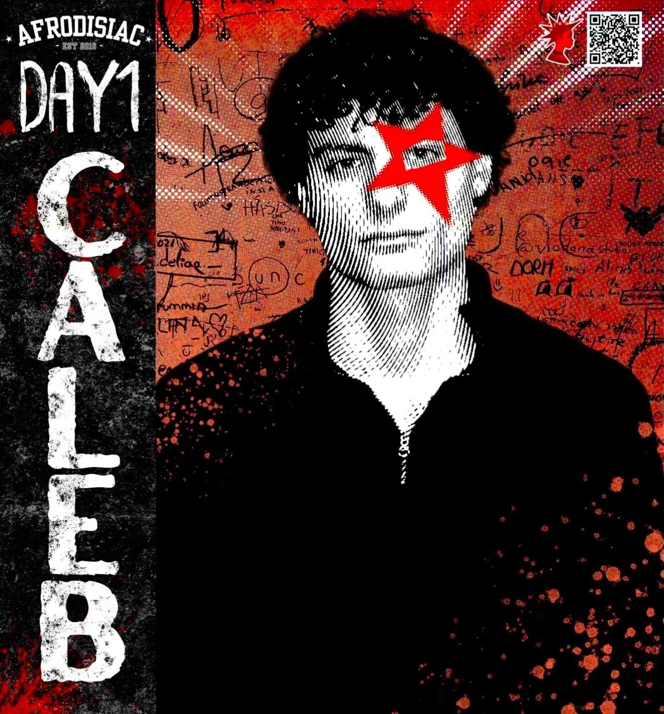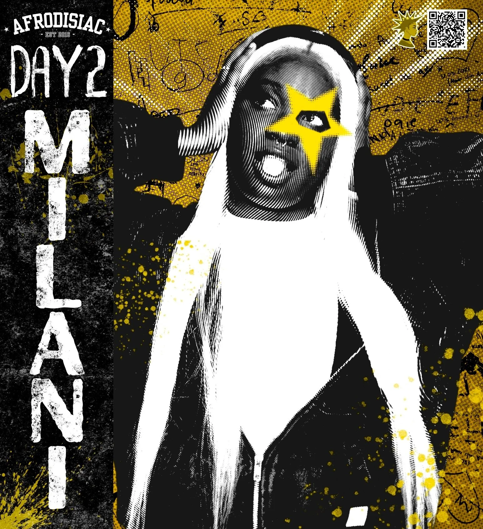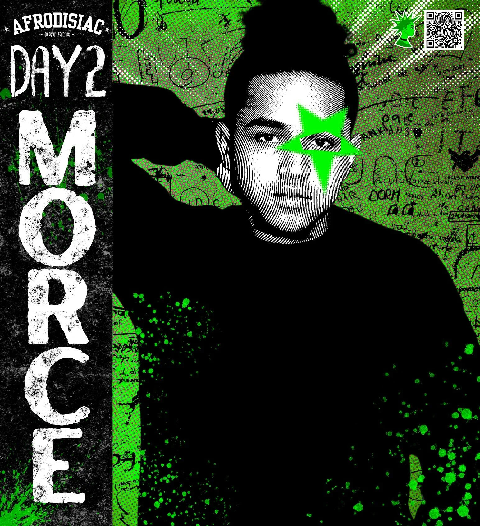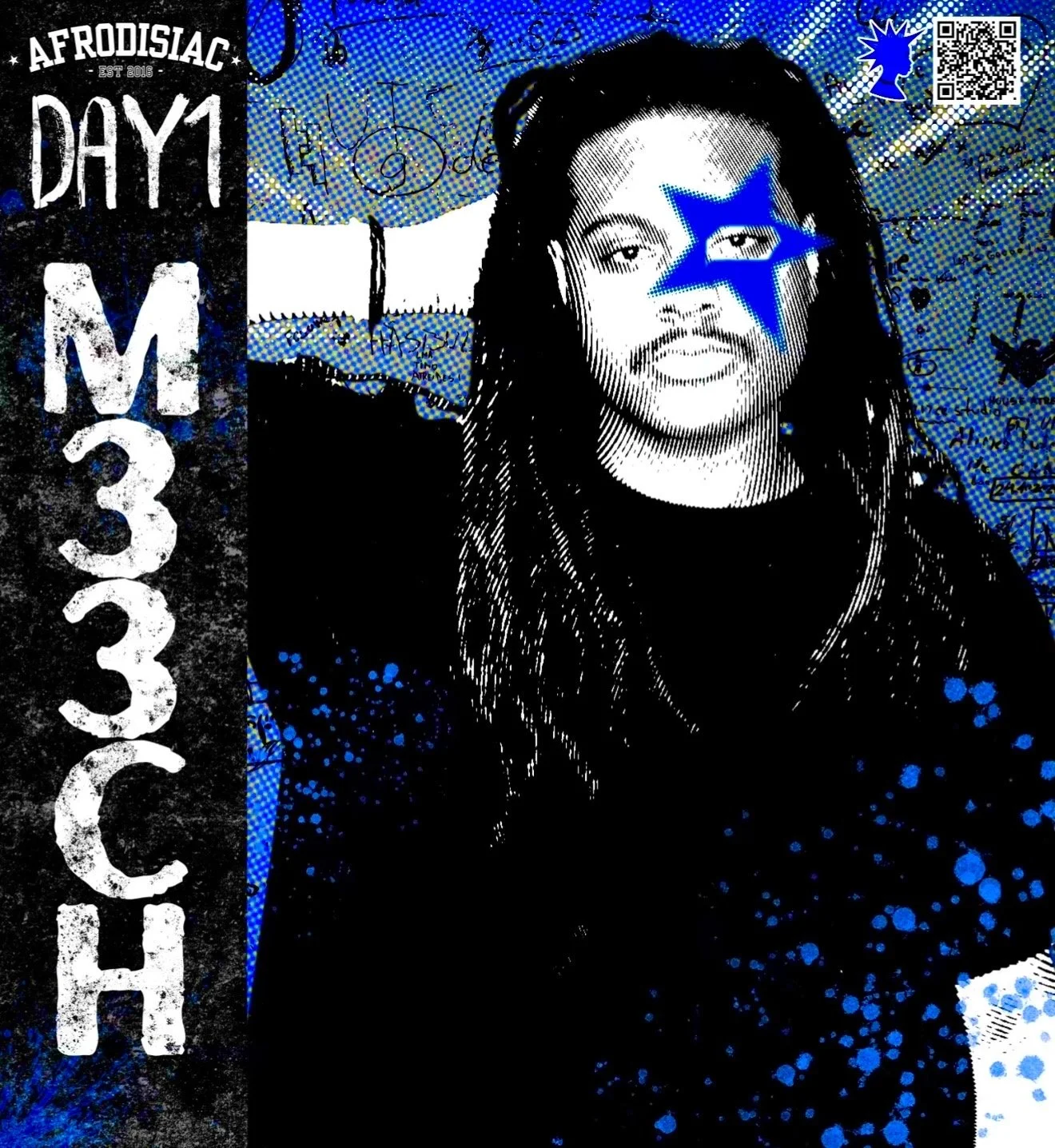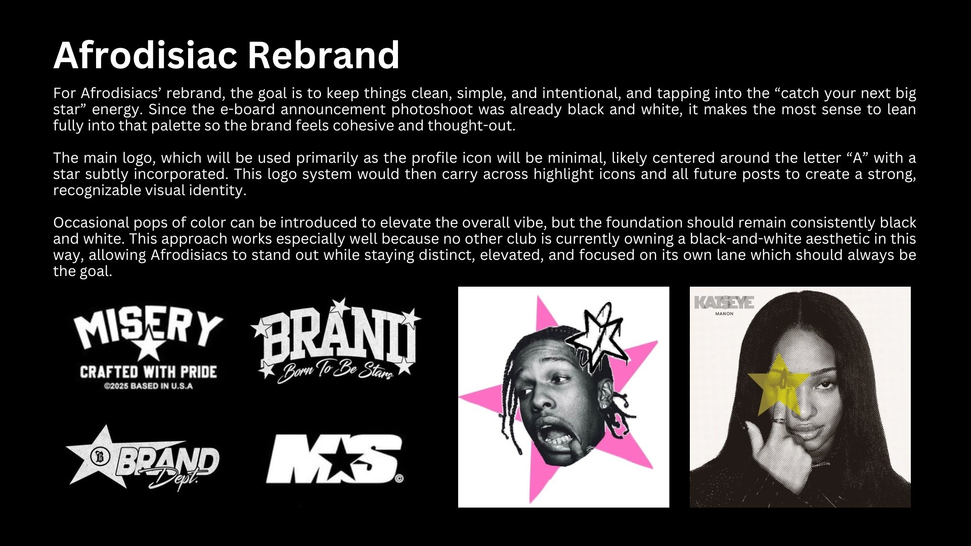
Because I joined Afrodisiac halfway through the planning process, I had to come in with a concise and adaptable plan that could build on what was already being promoted while still feeling intentional. My goal was to create a rebrand that introduced a strong, recognizable aesthetic, one that students could instantly associate with Afrodisiac whenever they saw its colors and visuals across campus.
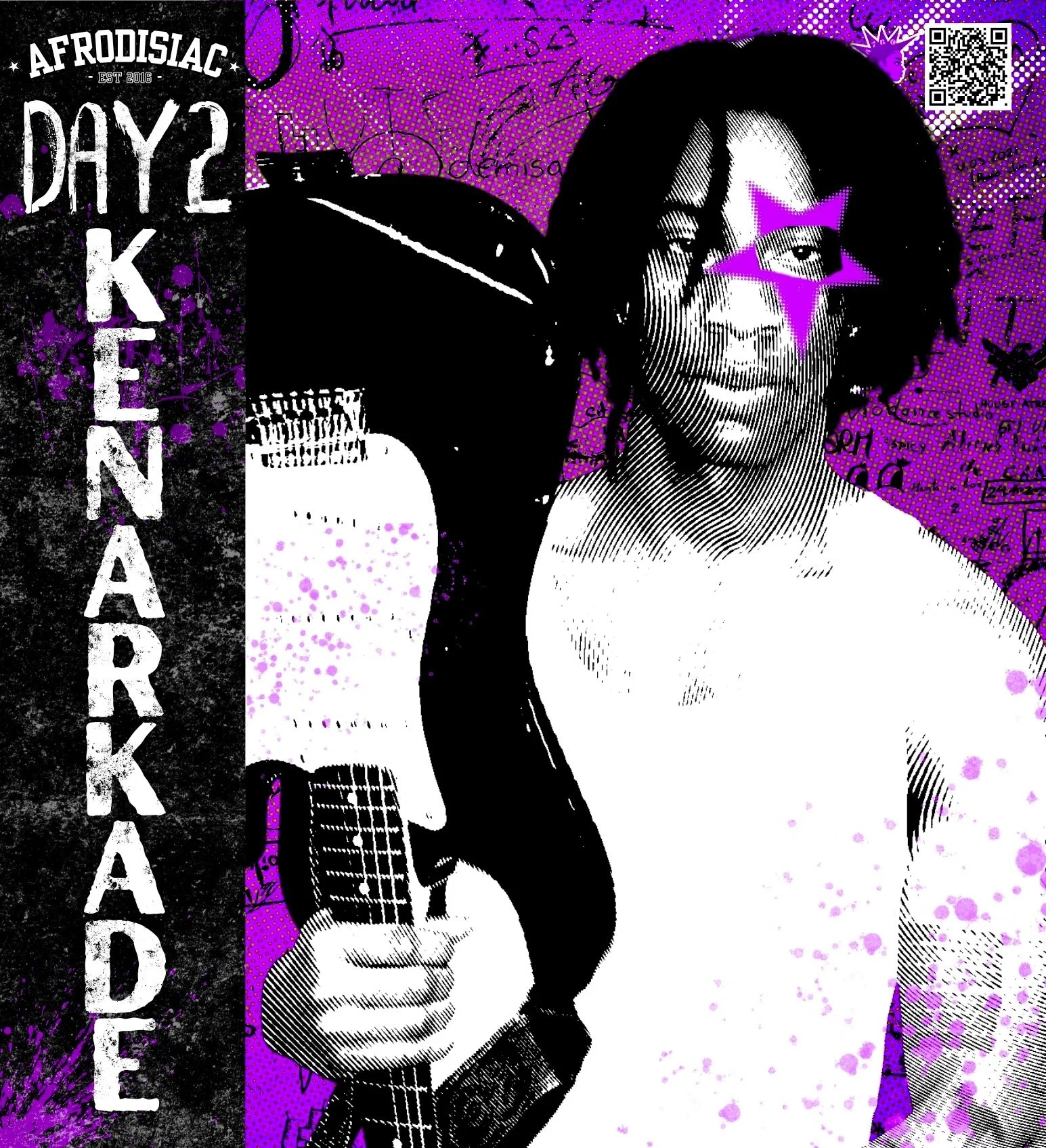
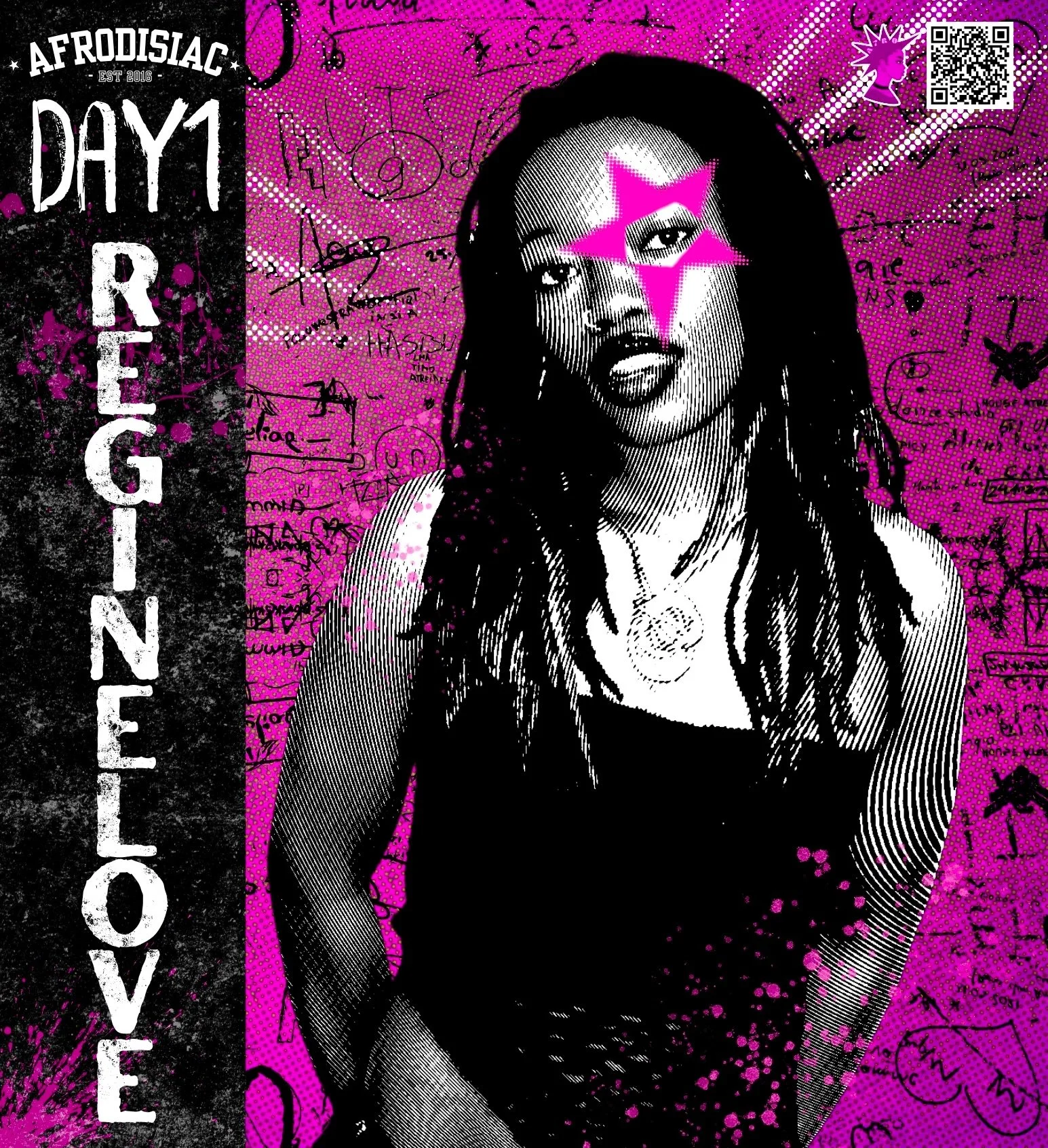
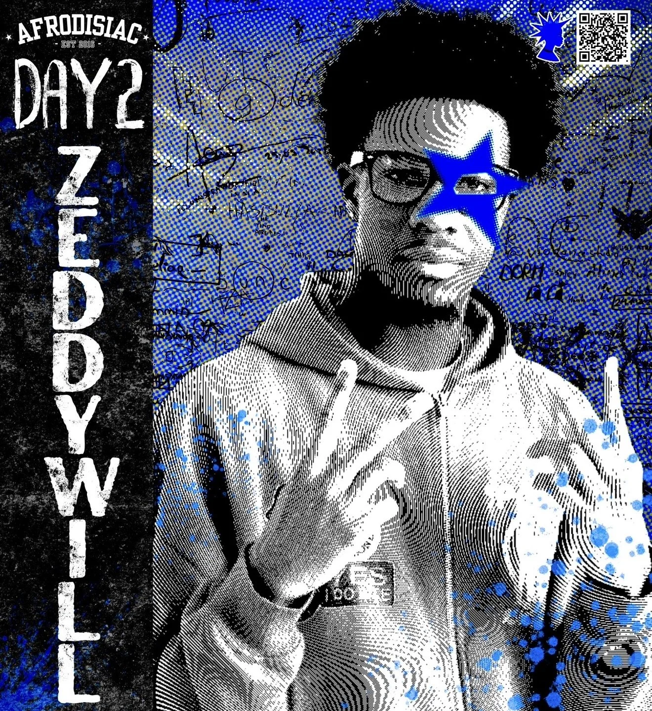
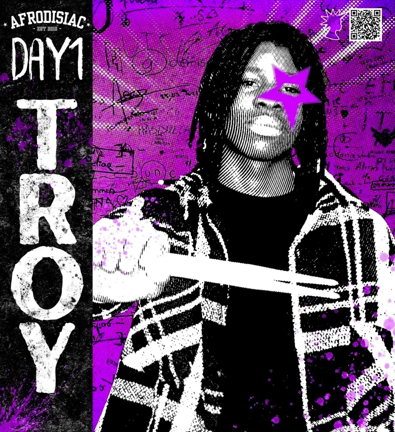
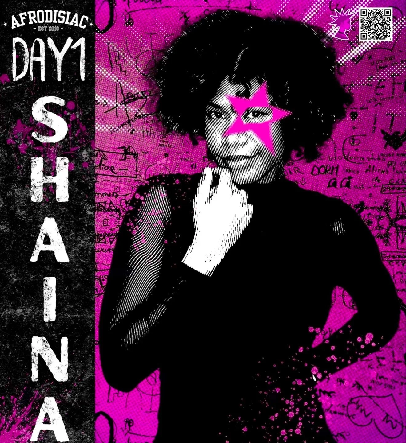
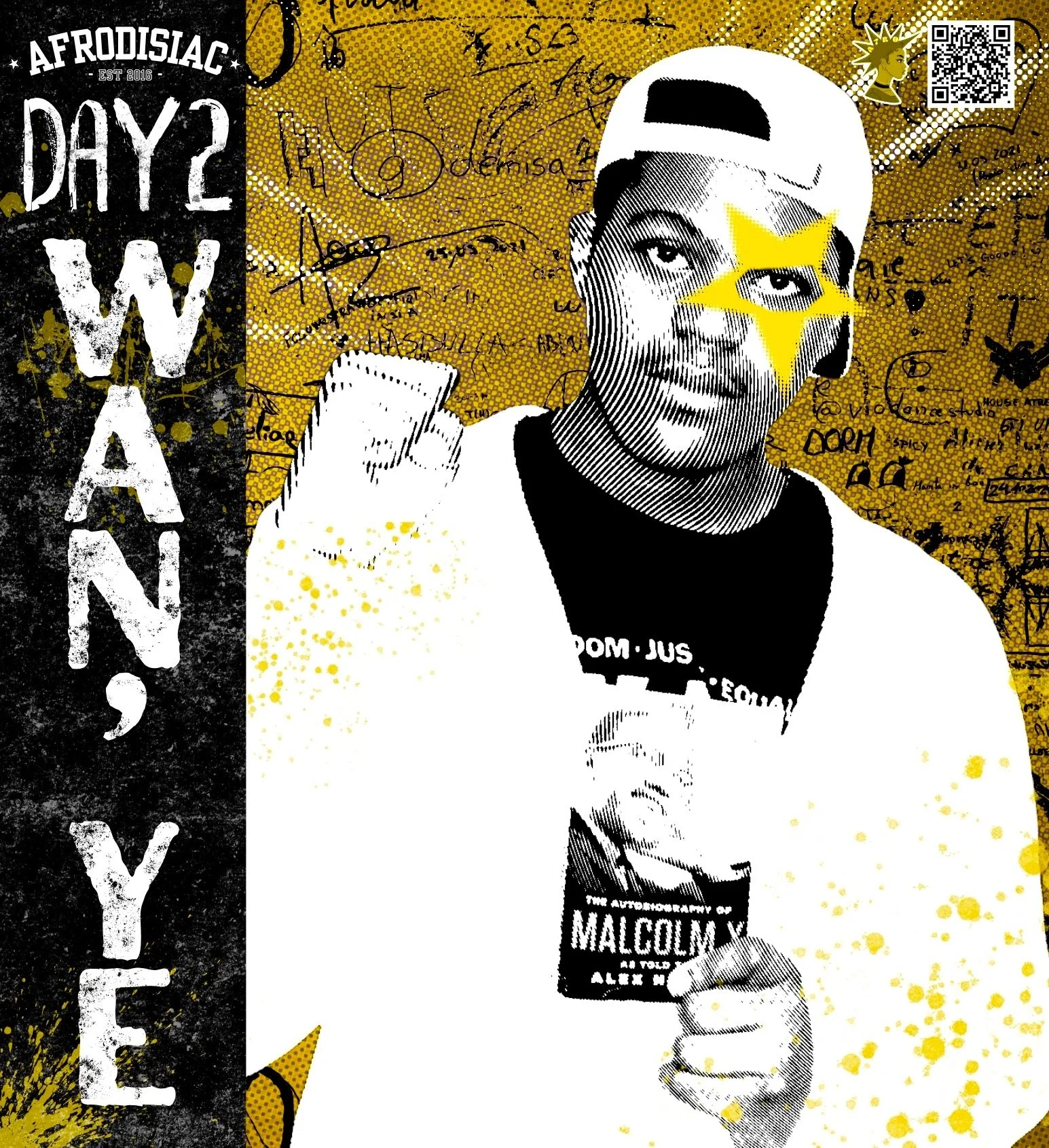
To the right, you can see the rebrand pitch, and below you can see how I executed the plan and translated that inspiration into the final experience. All photos and designs are by me.
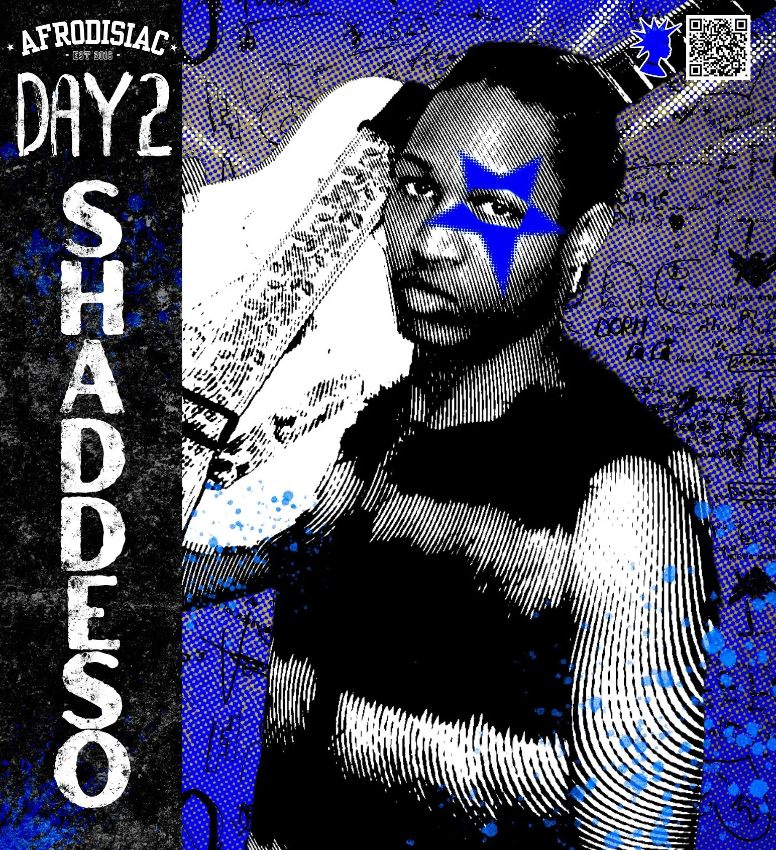
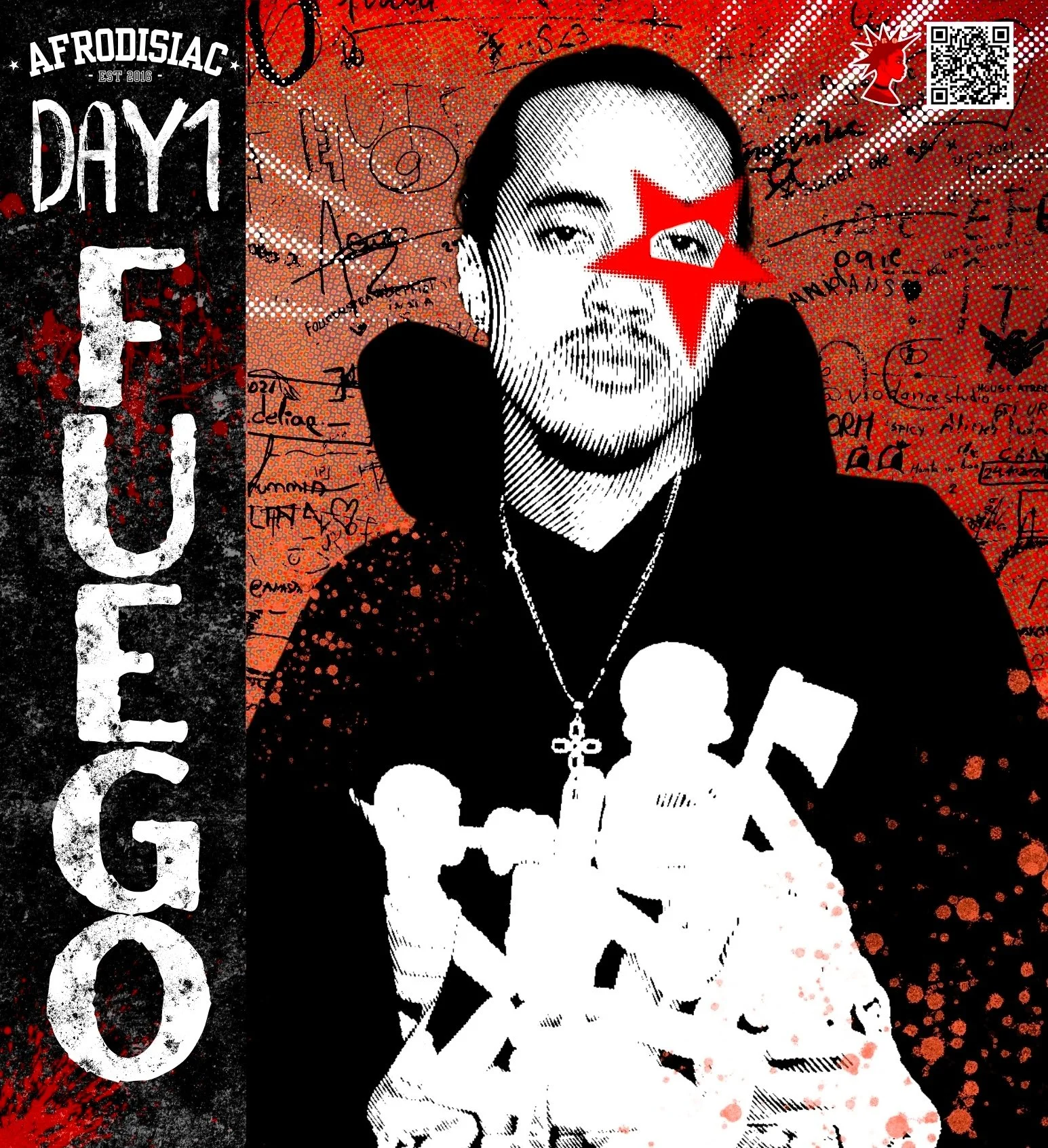
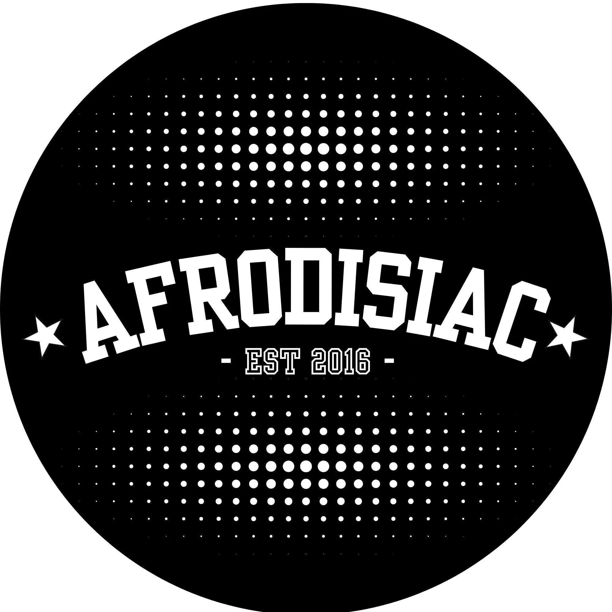
Logo Design
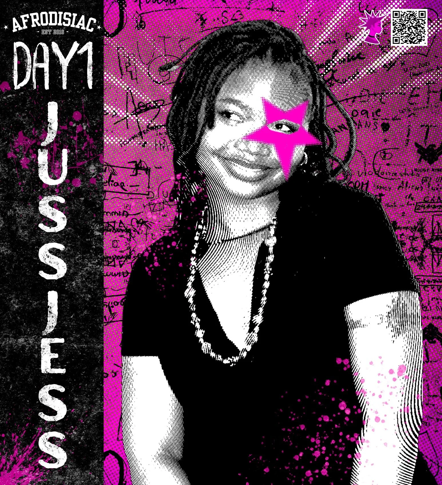
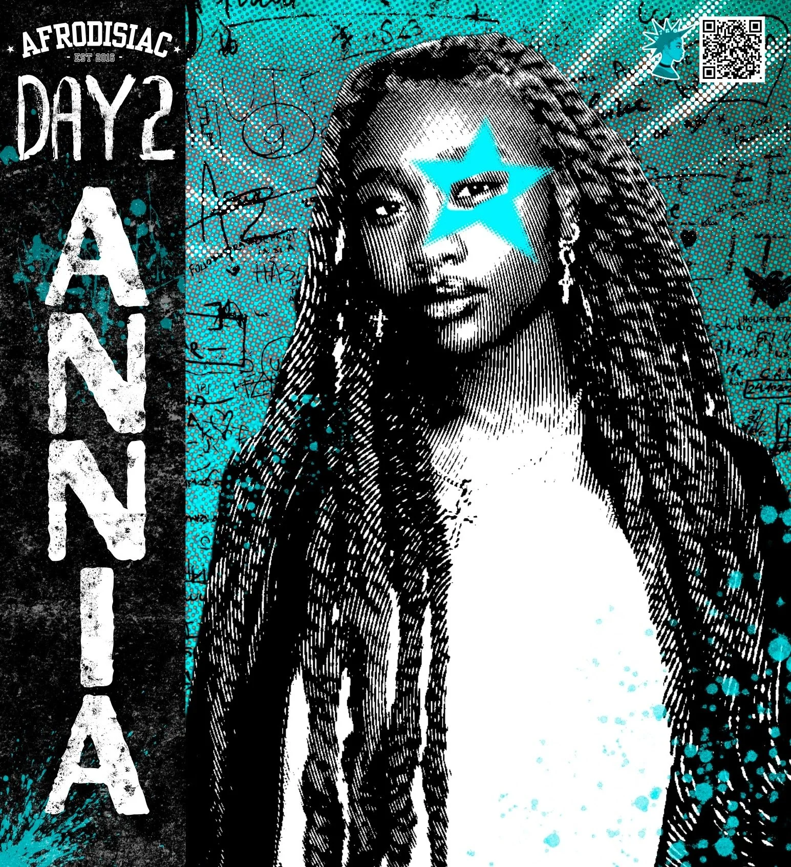
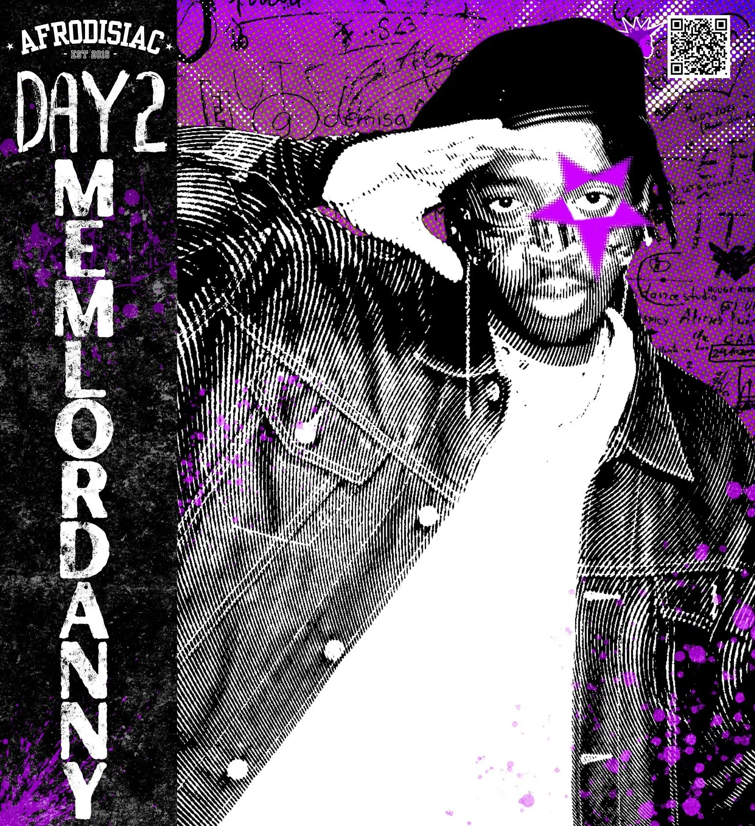
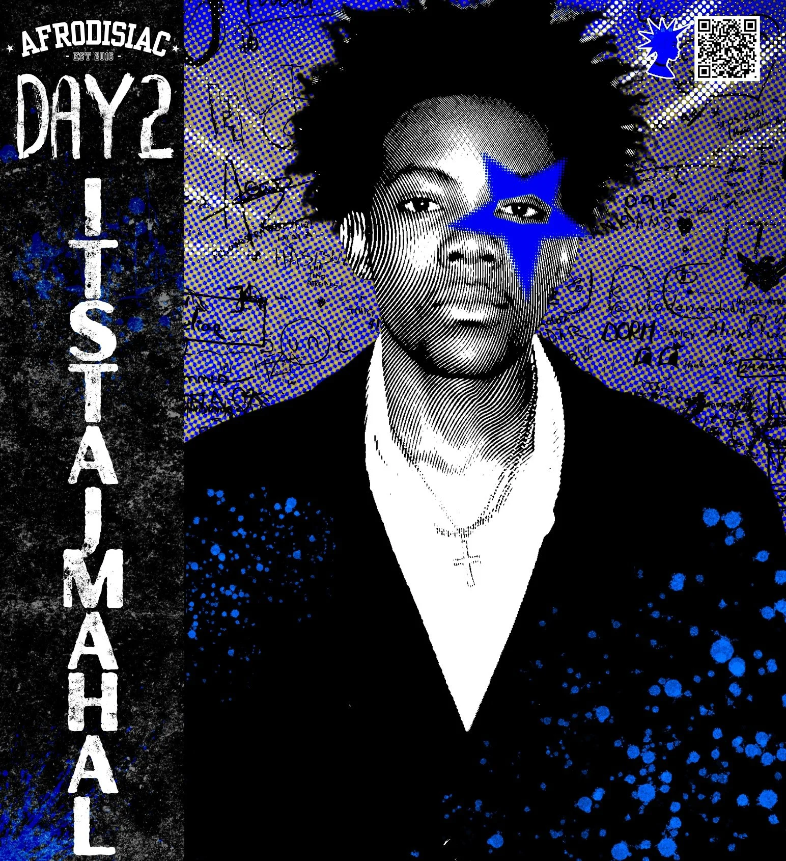
For the main logo, I introduced a playful halftone effect at the top and bottom, paired with a star motif on either side of the Afrodisiac title to give it a bold, cohesive identity. I also made sure to include “Established 2016” to highlight the event’s 10-year anniversary and honor its legacy.
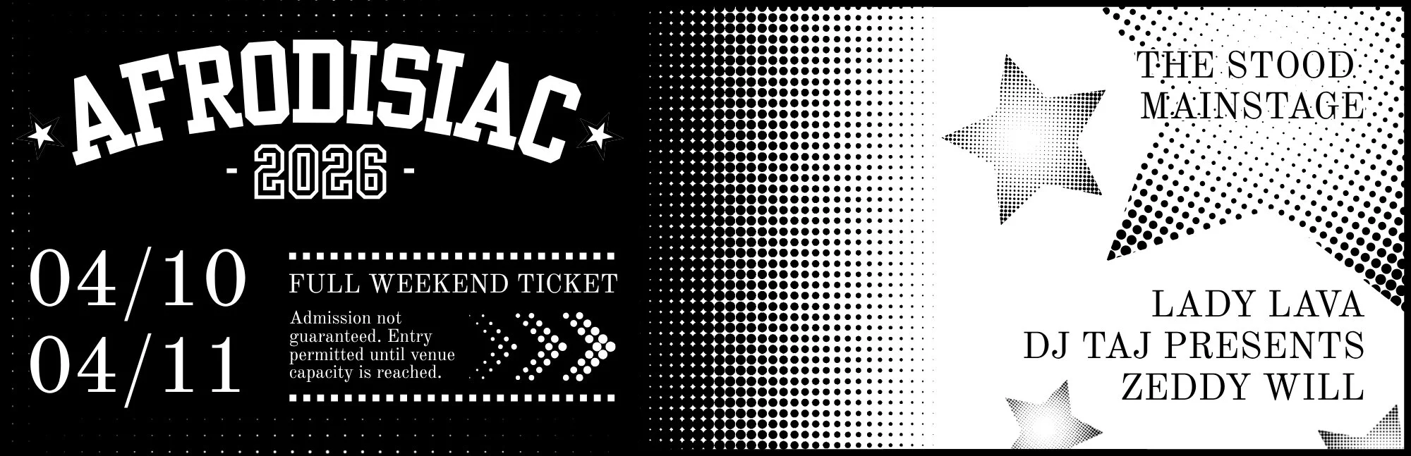
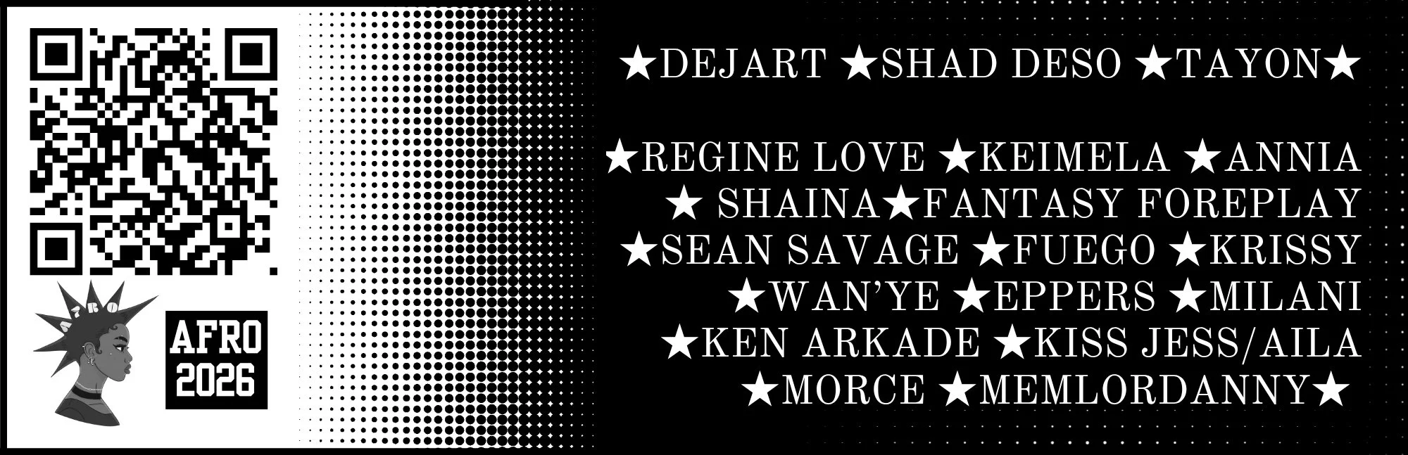
Ticket Design
I felt this year was the perfect opportunity to introduce custom tickets as a way to elevate the overall concert experience. I designed them to align with the event’s visual identity, incorporating the same halftone elements used throughout the promotion. The front highlighted the two celebrity headliners, while the back featured all student performers. Beyond serving as entry passes, the tickets also became meaningful keepsakes for performers to look back on and remember the event.